
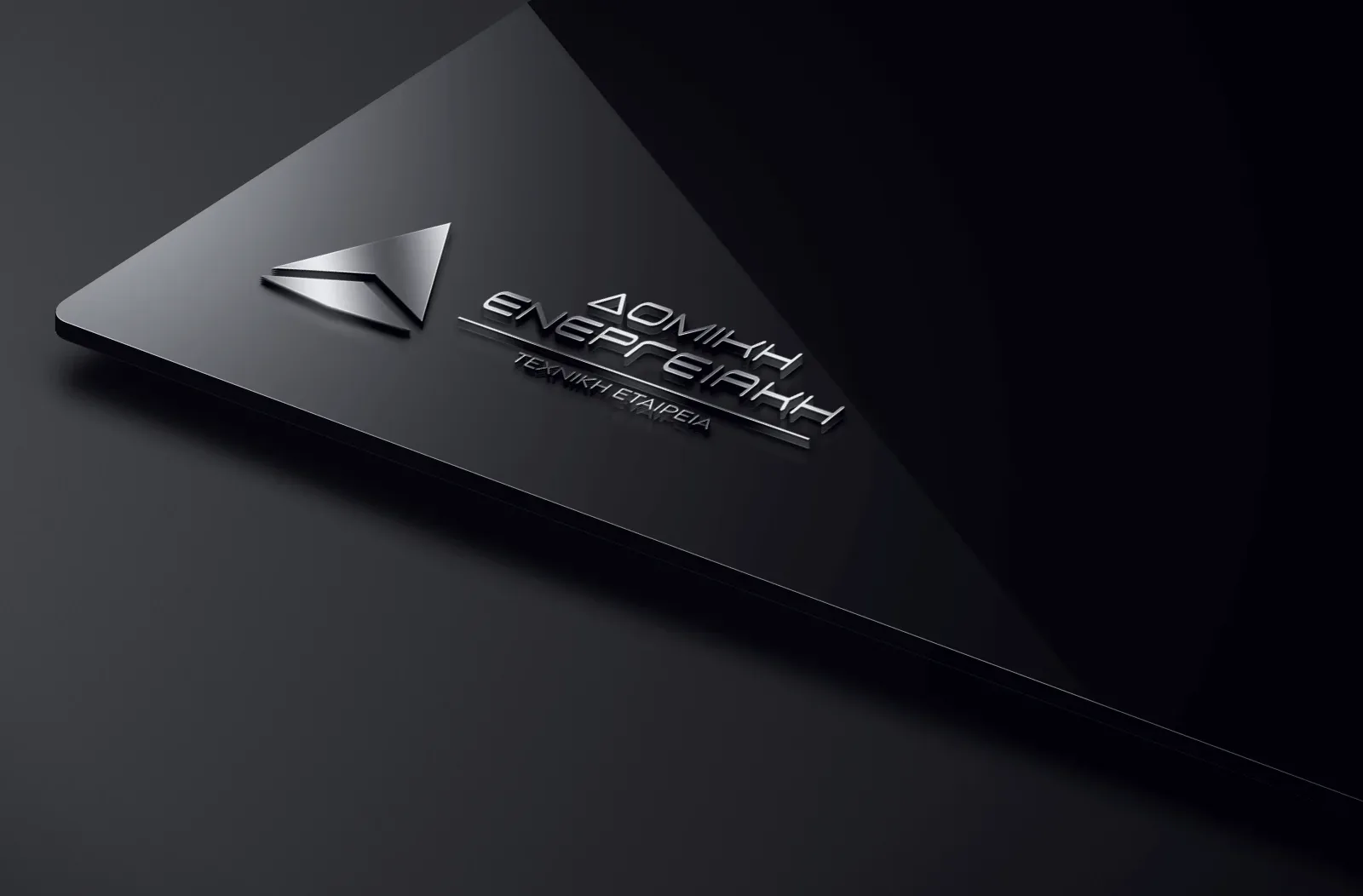
Case Study — Brand Identity & Web Design
Domiki Energeiaki
A technical construction company in Lamia — one identity carried from the site office to the screen, built on geometry, balance and restraint.
Overview
Domiki Energeiaki builds and renovates urban and tourist properties, and advises on energy efficiency. The work was to give a company that trades on precision an identity precise enough to carry it — on a helmet, on a letterhead and on a screen alike.
01 Brand system
One mark.
Two atmospheres.
A flexible identity designed to remain distinct, balanced and unmistakably Domiki — in light and dark environments.
The concept
The triangular mark draws from structural geometry, elevation and forward movement.
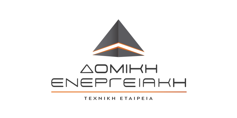
01 — Light version
Colour Palette
Industrial restraint
A restrained palette balances technical authority with the warmth
of an established local business.
- 01 Paper White #FFFFFF
- 02 Signal Orange #EE8F20
- 03 Graphite #282828
- 04 Near Black #141414
Screens
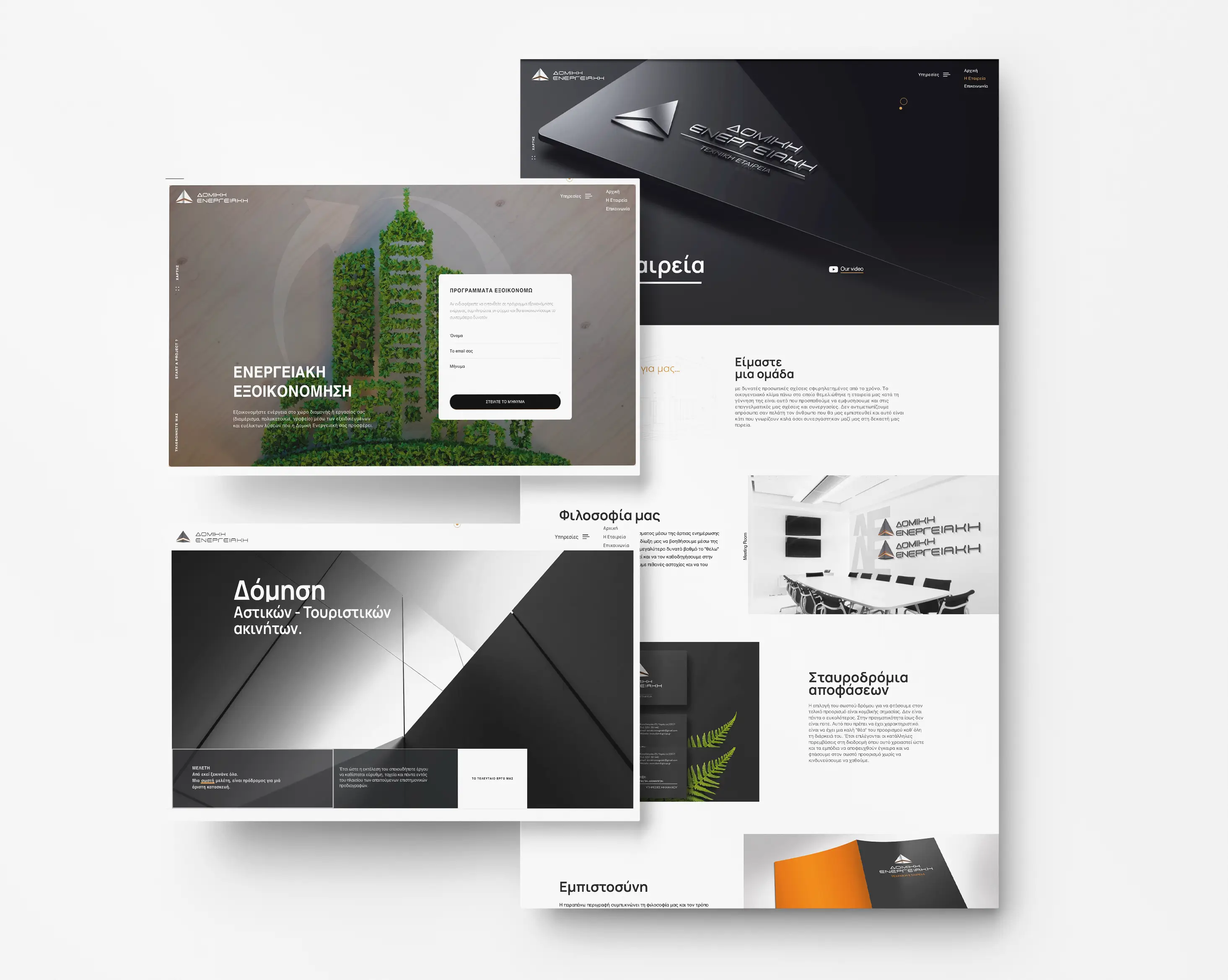
From paper to pixel
Film
The same language, in motion
A presentation film for the company and the services it offers — construction, energy efficiency, engineering. The mark, the palette and the type carried off the page and into moving image.
Stationery
Across every surface
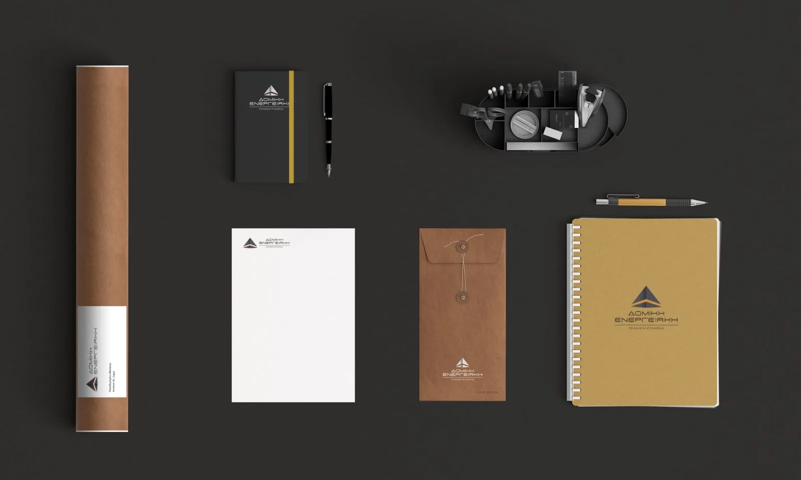
02 Brand collateral
Made to be held.
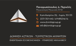
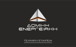
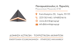
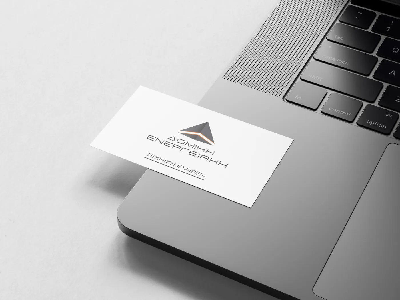
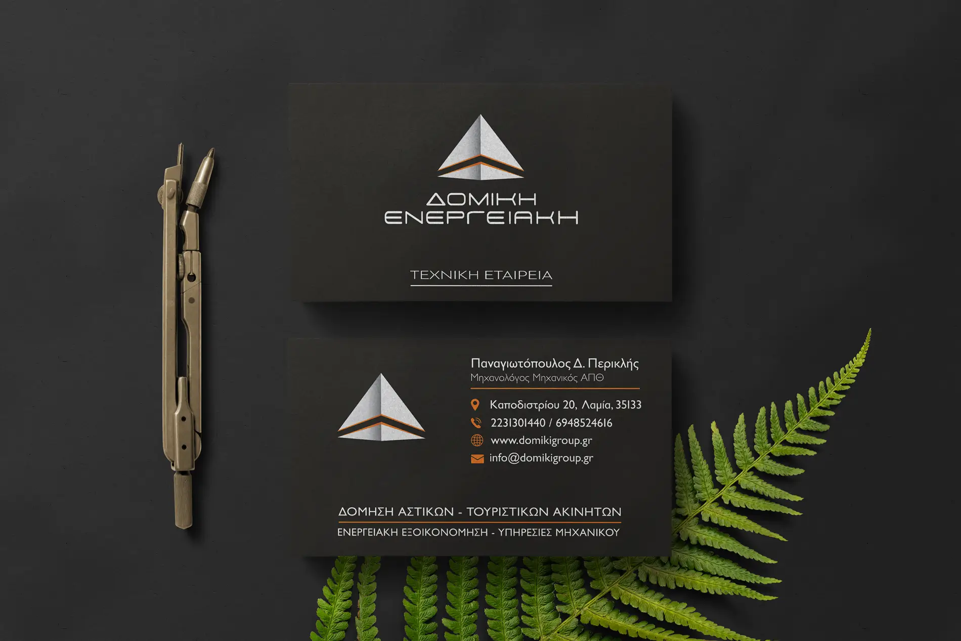
A restrained business card system that carries the identity from screen to paper — precise, confident and instantly recognisable.
01 / Light
02 / Dark
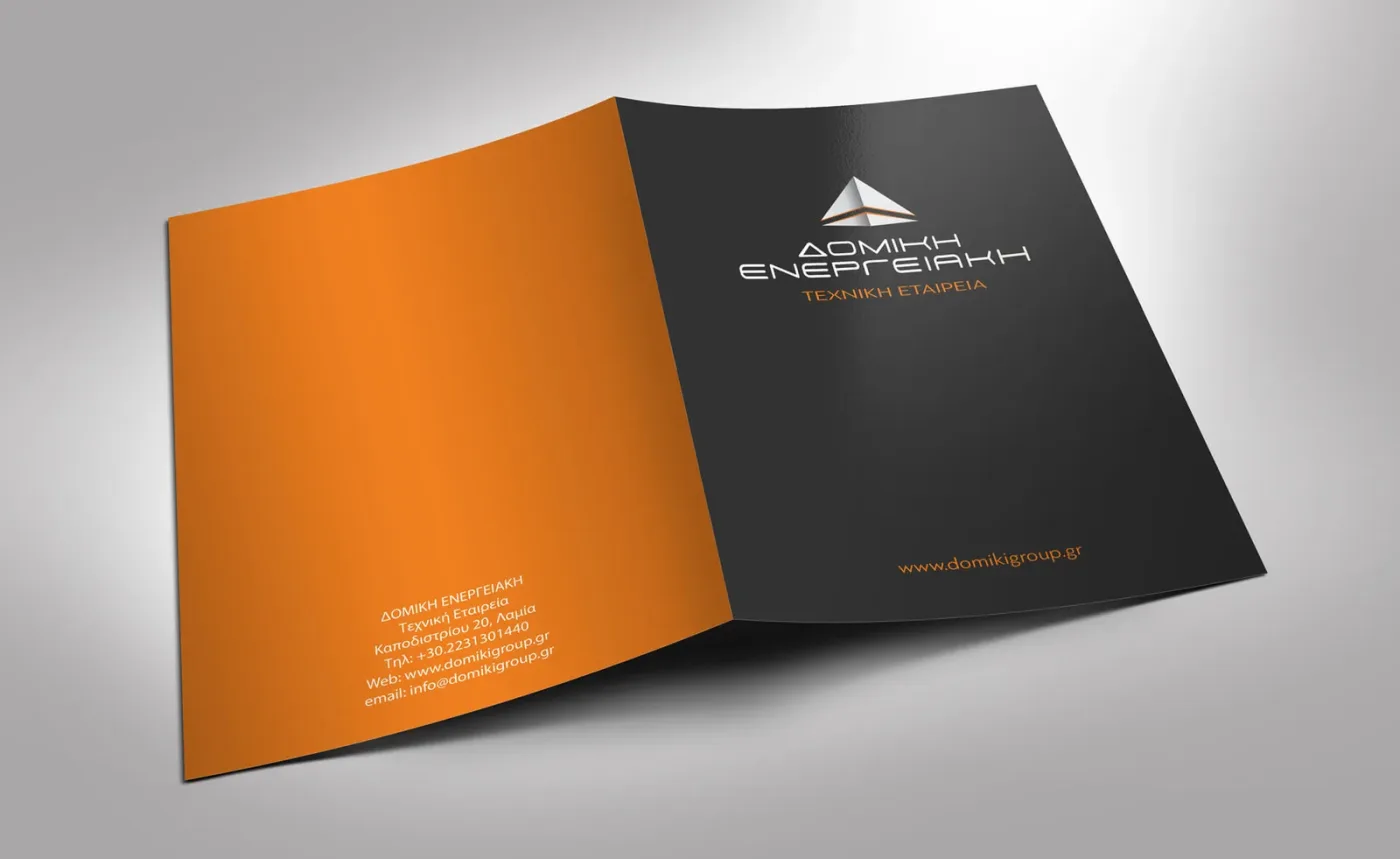
Folded, sealed, sent
On site
Out into the real world
An identity for a construction company does not live on a screen. It has to survive daylight, dust and a curved surface — so the mark was drawn to stay legible at any size, in one colour, on anything the company actually touches.
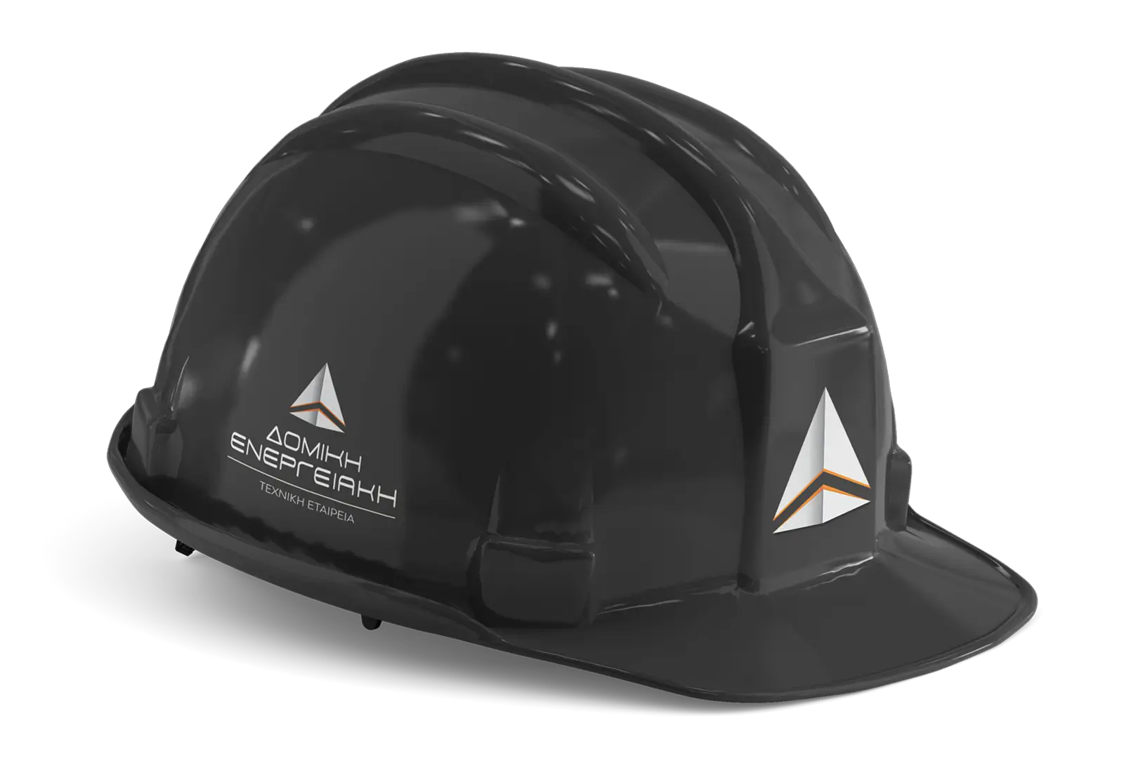
Two sides
Both faces, one geometry
One identity. Built across every touchpoint.
From the first sketch of the mark to the final page of the website, every element grew from the same geometry — creating one consistent identity across print, worksite and screen.
Get in touch
Want something like this?
Tell me what your business needs to do, and we’ll start there.