
Case Study — Web Design & Development
Physiokatsarou
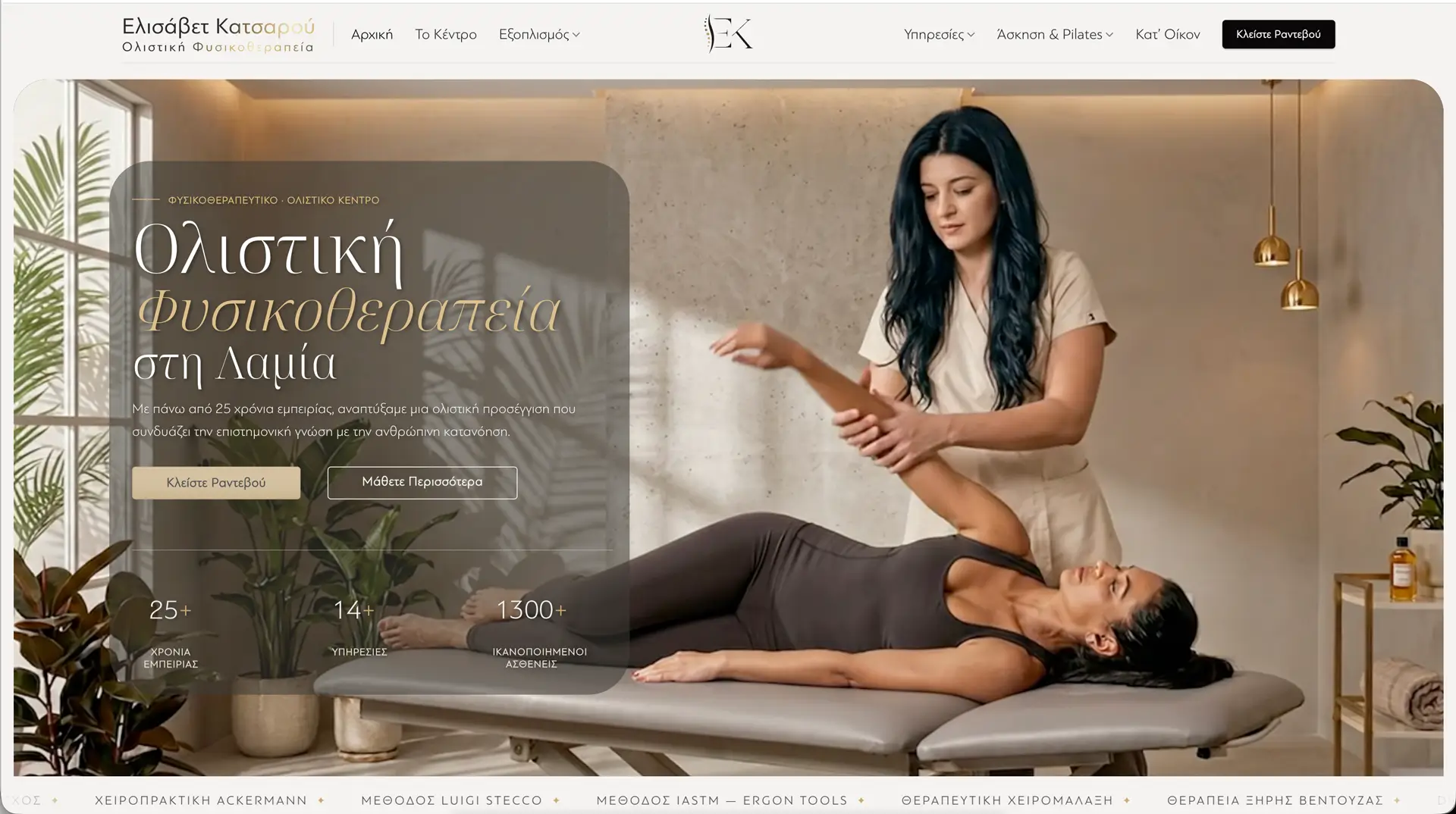
A holistic physiotherapy centre in Lamia — a warm, editorial website built to mirror 25 + years of clinical expertise and turn visitors into booked appointments.
Overview
The goal was to create a digital experience that reflects the calm, professional and highly personalised care offered in the clinic. Every design decision—from typography to colour palette—was made to inspire trust before the first appointment.
Colour Palette
Colours used
- 01 Warm Ivory #F7F5F3
- 02 Antique Gold #C5A576
- 03 Bronze #9A885F
- 04 Warm Charcoal #292824
- 05 Ink Black #0B0809
Typography
Chosen with purpose
A refined type pairing that brings clarity, elegance and personality to every part of the experience.
View on Google FontsABCDEFGHIJKLMNOPQRSTUVWXYZ
abcdefghijklmnopqrstuvwxyz 1234567890
ABCDEFGHIJKLMNOPQRSTUVWXYZ
abcdefghijklmnopqrstuvwxyz 1234567890
- 2 Families
- H Clear hierarchy Easy to read
- AA Balanced contrast For a refined look
- Optimised spacing For all devices
- Greek support Full character set
Motion & Detail
The mark, in motion
The logo, monogram and favicon were all designed from scratch for Physiokatsarou — then brought to life. These aren’t screenshots: it’s real, animated SVG that quietly swings, shimmers and lights up gold on ivory. The kind of detail that rewards a closer look.
-
Animated seal Swinging lettering · glowing spine
-
Shimmer wordmark Gold light sweep
-

Glowing monogram Favicon · sequential gold
Screens
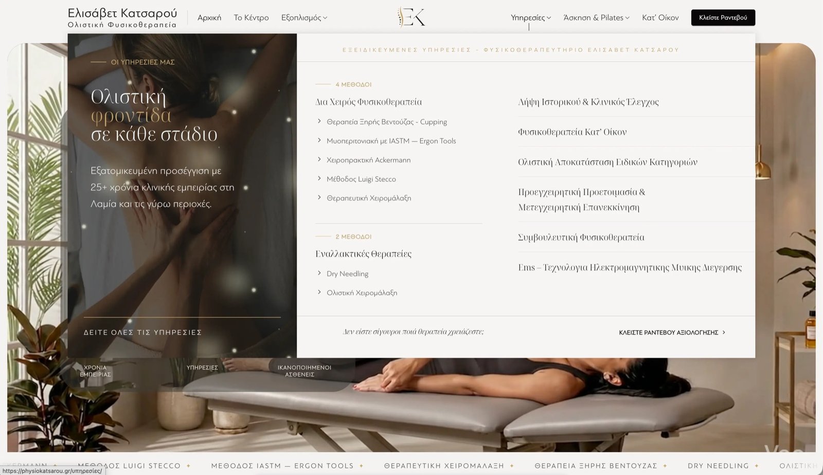
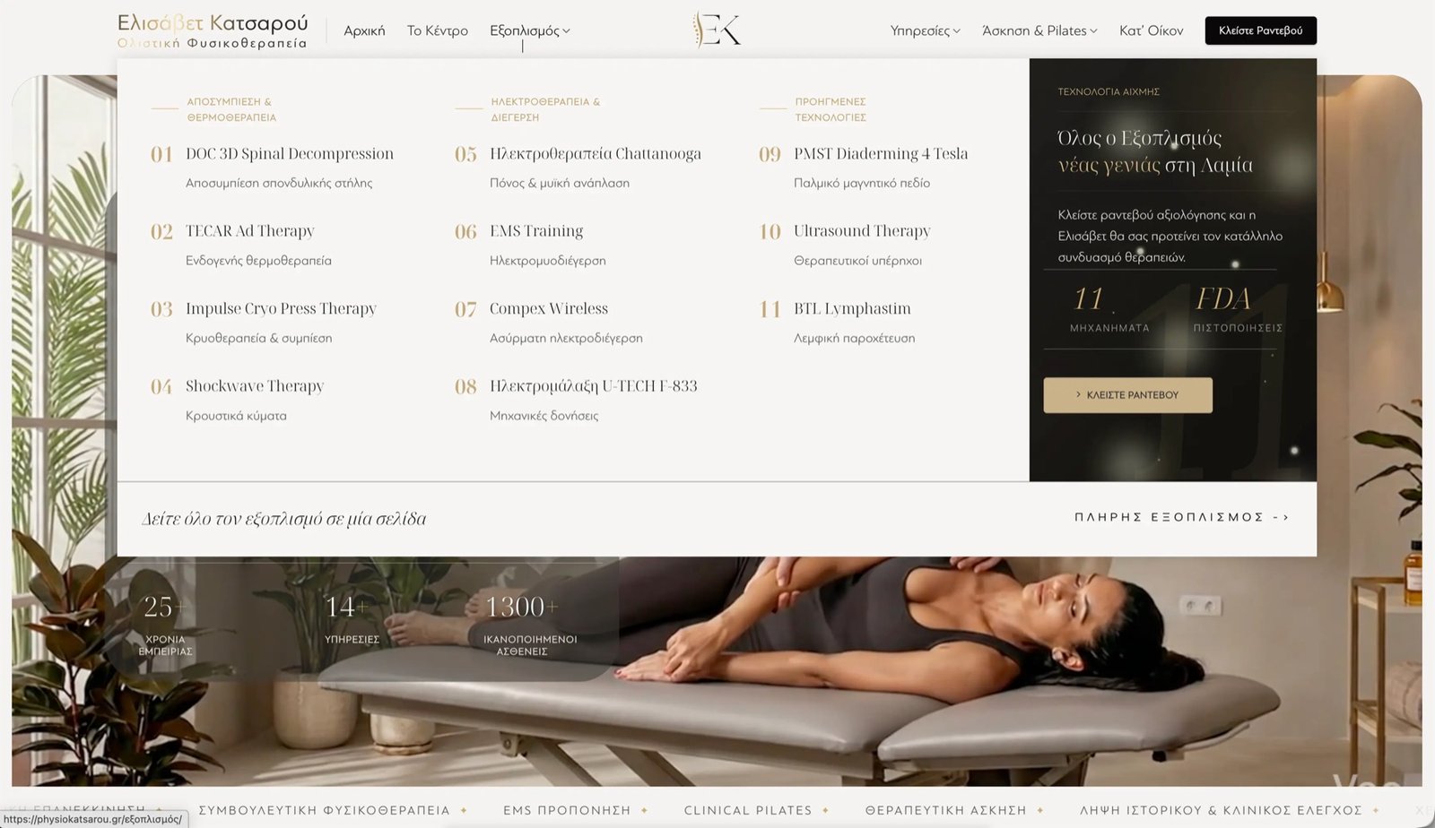
Inside the site
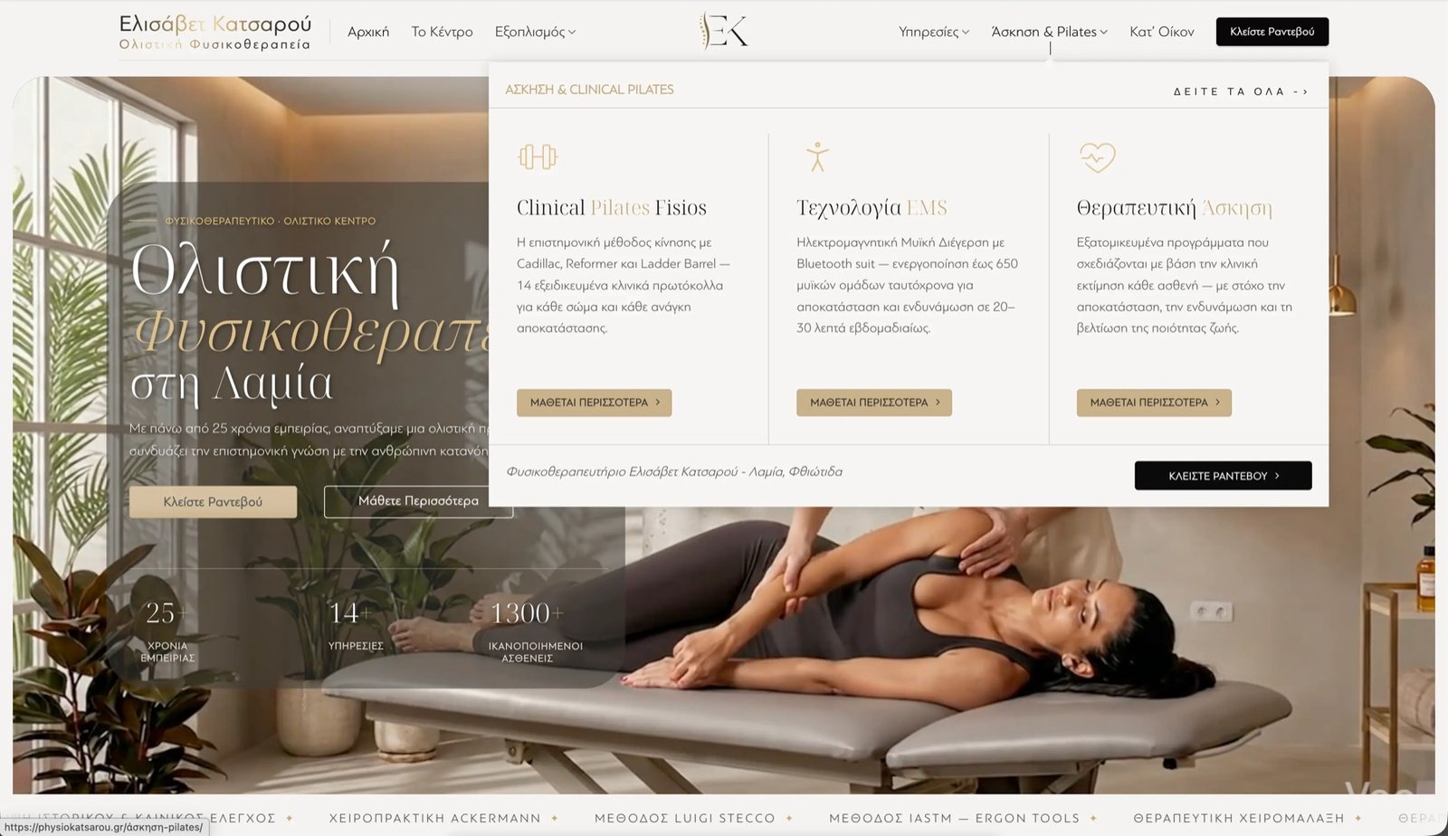
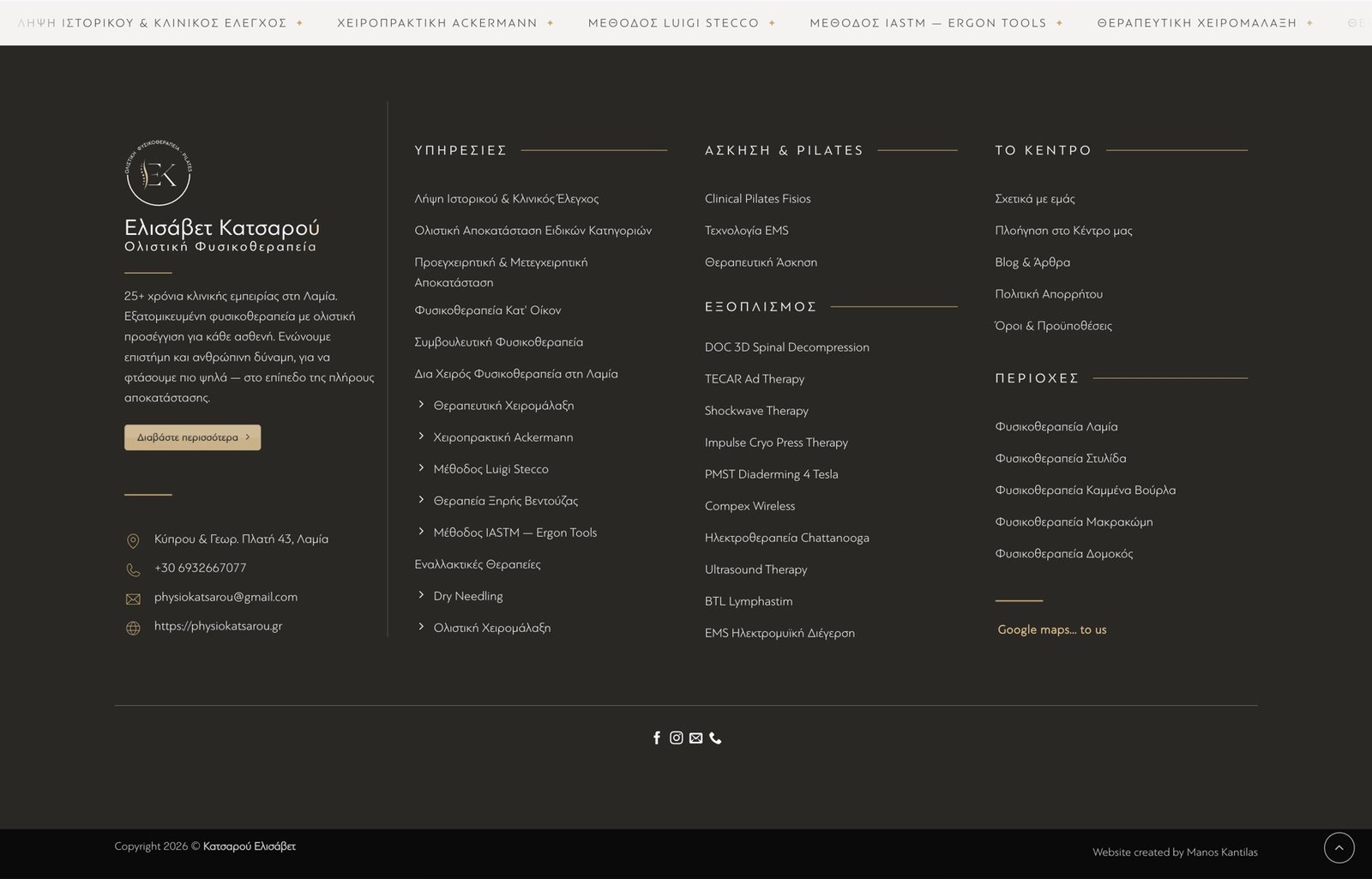
Built to Perform
Engineered for performance.
A beautiful website is just the beginning. This project was developed with speed, accessibility and best practices in mind — to deliver an exceptional experience on every device.
- 99Performance
- 100Accessibility
- 100Best Practices
- 100SEO
- 0.6s First Contentful Paint Fast loading start
- 1.1s Largest Contentful Paint Main content loads fast
- 0.00 Cumulative Layout Shift Visually stable
- 1.0s Speed Index Quick visual progress
Tested with Google PageSpeed Insights — desktop.
Beyond the Screen
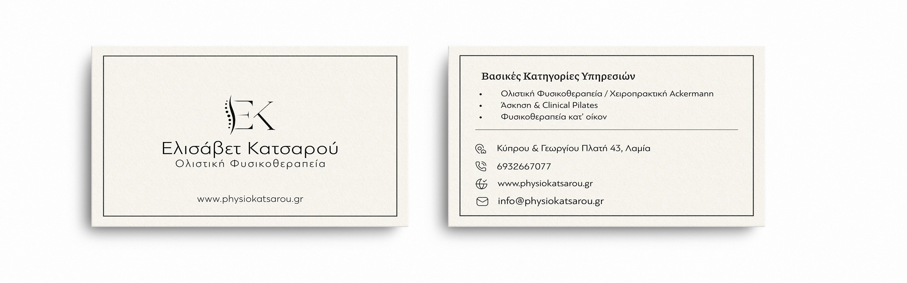
Minimal by intention
One monogram. Refined typography. Nothing unnecessary.
Everything that didn’t earn its place was removed — leaving a business card that feels calm, confident and instantly recognisable.
Every detail was designed with one goal.
To create a digital experience that feels as calm, refined and trustworthy as the care patients receive in the clinic.
Get in touch
Want something like this?
Tell me what your business needs to do, and we’ll start there.
See more selected work
Back to all projects